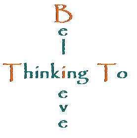
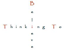
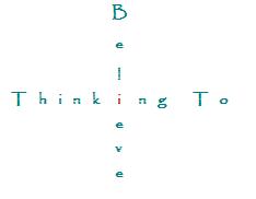
I have determined to start an official apologetics ministry. My first order of business was to create a name. I settled on “Thinking to Believe” (unless any of you can think of a better name), since this represents my conviction that thinking is vital to both the acquisition and growth of faith.
My second order of business was to work on a logo. I have come up with 20 different options. I covet your help in determining which one I will go with. I have numbered them 1-20. It would really be a help to me if you could tell me what you think are the top three, in order of your favorite, second favorite, and third favorite (just list the logo numbers).
Of course, if any of you are into design and want to take your own stab at it, that would be great as well. You can email me your work at jasondulle@yahoo.com. As you can see from the diversity present, I am open to different looks, but I prefer something that has an “intellectual aura” to it. I really like the medieval look (both letters and symbols/designs), so if you could come up with something along that line, that would be great. Thanks!
Option 1

Option 2

Option 3

Option 4

Option 5

Option 6

Option 7

Option 8

Option 9

Option 10

Option 11

Option 12

Option 13

Option 14

Option 15

Option 16

Option 17

Option 18

Option 19

Option 20

Option 21

Option 22

July 28, 2009 at 2:40 am
Hi,
1st = Option 4
2nd = Option 8 (although “something” missing I think (don’t ask me what though))
3rd = Option 7
I do like the + options, but just think its difficult to read the believe. Plus, you might get some conspiracy theories going round as it is an even armed cross (reading the Da Vinci Code at moment hence the realisation!) – Priory of the Sion and all that! 🙂
LikeLike
July 28, 2009 at 6:00 am
I would immediately scrap options 13+, then nix everything with a drop-shadow. Next, scrap everything with the font, “Papyrus”, as it’s an overused stock Adobe font.

That narrows the playing field quite a bit.
I would then take the font from option 8, and keep the word, “Believe”, but change the font of, “Thinking to” to a clean, serif font like “Big Caslon” and right align them like this…
LikeLike
July 28, 2009 at 6:05 am
Sorry, that was written a bit in haste. 🙂 I didn’t mean to come off sounding short! Good job taking a stab at the logo, Jason.
LikeLike
July 28, 2009 at 6:35 am
I like #4, and it might be even better if you remove at least one of the crosses; maybe both, since the T’s already suggest that symbol. Frankly, I do not find any of the other options to be very appealing, but if I had to vote for two more, I would go with #9 and #1. As you can probably tell, I tend to prefer simplicity and clarity.
LikeLike
July 28, 2009 at 8:18 am
Jay Jones – Wow! Like that quite a lot – could you put colour in it somewhere?? Such as believe in red?? Then it would win my vote! 🙂
Also agree with aletheist on removing the crosses – might look better.
LikeLike
July 28, 2009 at 3:33 pm
Jason,
Very, very glad to hear this good news! Looking forward to what you’ve got coming.
As far as the logo goes, I really like Option 8, though I think it’d be cool to move the “to” to the top right above “believe” and make the “T” of “thinking” a large gothic/celtic cross or something like that. I’d try it myself but I don’t know what fonts you are using for Option 8…send me the file!
Later,
Chad
LikeLike
July 28, 2009 at 4:55 pm
Jay, how in the world are you?! I haven’t heard from you since I was part of your forum years ago. The last I knew, the forum had closed. It looks like you are up and running again, but it is no longer a forum. Good for you. I hope you begin to visit me regularly from now on.
So far, 4 and 8 seem to be leading the pack.
My wife’s vote is for options 2 or 8. I’ve been leaning toward 2, 4, and 18 myself. I like 8. The only thing I have against it is that I know it is a “Western” font. When I see it, I think of cowboys and Indians. I like Jay’s reworking of it, but I would add back in the colored “to.” I also want to try the cross for the “T” in “Thinking.” Good suggestion Chad. I’ll send you the font so you can play around with it.
Keep ’em coming!
Jason
BTW, everyone does realize that the number of each logo is located above the logo, right? I wouldn’t want you to say “8” when you are really referring to “7.”
LikeLike
July 28, 2009 at 5:16 pm
I just incorporated Jay and Chad’s feedback in regards to option 8, and added it as option 21. The “t” cross was the best example I have of a “t” that looks like a cross, but it does have a hook on the end. Do you think it looks good like that, or should I try to find a real cross?
Jason
LikeLike
July 28, 2009 at 7:30 pm
I pick 2, then 12, then 4. I don’t like the ones with the words crossing, and “bi” and “tit” in orange.
LikeLike
July 28, 2009 at 8:46 pm
Jason,
Great to chat once again. 🙂
Yes, I closed preachingpoints.com several years ago when my wife was ill and in the hospital… I just couldn’t keep up with it at the time. Last year I revived it as a preacher’s resource site, and am having a blast with it. I’ve been checking your blog out regularly, and have added your RSS feed to my Reader. Great stuff, man… I hope you keep it up!
LikeLike
July 29, 2009 at 1:04 am
In option 21, try using the “T” from option 4. I don’t like the “T” in option 21. Also, any reason not to have the “Believe” in red??
LikeLike
July 29, 2009 at 1:49 am
Scott,
I did use the “t” from option four: the lowercase “t” in the word “to.” It looks more like a cross than does the capital “T.”
As for making “believe” red, the color itself is not set in stone yet. I’ll play around with that once the design is set, but it’s unlikely to be red, as I am not a big fan of red.
Jason
LikeLike
July 29, 2009 at 1:50 am
I found a true cross font that is decent, so I have swapped out the “t” in option 21 for a true cross in option 22. What are everyone’s thoughts on option 22?
Jason
LikeLike
July 29, 2009 at 2:07 am
Is it possible to move it so the leg sits on same line as the h? and pull it across so the horiz. line goes over the h?? Just looks a little too far to left. Otherwise, better.
LikeLike
July 29, 2009 at 8:41 am
Also, just a side issue, but it appears http://www.thinkingtobelieve.com is not taken 🙂
LikeLike
July 29, 2009 at 12:51 pm
When you say “leg,” are you referring to the bottom of the cross?
Yes, I checked on the availability of that URL. I’m not sure if I’ll start a separate site for the ministry or not, but it would probably be a good idea to purchase it. I’m illiterate when it comes to these matters, so do you have any knowledge in regards to purchasing URLs?
Jason
LikeLike
July 29, 2009 at 1:42 pm
Scott,
I adjusted the cross in option 22 so that it is closer to “hinking to”.
Jason
LikeLike
July 29, 2009 at 3:03 pm
Jason,
A formal apologetics ministry is exactly what I have been anticipating hear you say (along with the release of an upcoming book release *ahem*).
1. Option 22
2. Option 21
3. Option 8
God Bless and good luck,
Dale
LikeLike
July 30, 2009 at 1:02 am
I’m afraid I have no knowledge in these areas either! 😦
LikeLike
July 30, 2009 at 2:05 am
22, 21, 2 in that order. Good luck on the new ministry!
Pentecostalblogger.com by Ryan
LikeLike
July 30, 2009 at 2:18 am
Just read about your needing help with the url purchase. Your best bet is to purchase it through your hosting company. If you don’t or can’t do that, try Blue Host which is the company I use. They host over a million websites and are extremely reliable and very affordable with decent customer relations. They have been around since 1996 which is ancient for a web company.
Give me a shout via e-mail at fireandsalt @ gmail . com if you need any help Brother!
Pentecostalblogger.com
LikeLike
July 30, 2009 at 7:55 am
Jason,
Talked to my brother (computer geek) and he recommended this:
http://www.uk2.net/
And he organised our church’s website http://www.bidfordbaptistchurch.co.uk and he’s about to install “drupal” for it which is a CMS (Content Management System) which allows you to create a website with new content without ever coding html.
LikeLike
July 30, 2009 at 7:57 am
1) option 12
2) option 10
3) option 8
LikeLike
July 30, 2009 at 8:56 pm
Jason,
I like #4 & #12.
John
LikeLike
July 30, 2009 at 10:39 pm
If you’d like, check out some of the sites I host off of my one account at bluehost.com:
HaShaliach
All Things Apostolic
Apostolic Christian University
Pentecostal Blogger
Logos Aletheia Forum
Those are just a few, but as you can see, bluehost allows a wide range of content to be installed… from forums to WordPress blogs (as well as others)… to full blown CMS (Drupal and Joomla being the most popular)… to Course Management Software.
Wikis, FAQ, and storefront software is also available for install on your site, all through click installers using a back end software called cpanel.
Can’t recommend it highly enough (as you can probably tell with my 3 posts to this blog entry LOL).
LikeLike
July 31, 2009 at 1:07 am
I’d go with fireandsalt’s servers!
He knows more then me, plus, they’re probably based in th US!!
LikeLike
July 31, 2009 at 6:38 pm
8
21
22
LikeLike
August 31, 2009 at 9:01 am
I like evidential faith. lol Hmmmmmm…just saw this Jason. I like option 22. I would however change the color emphasis from “to” to either “thinking” or “believe”. As it sits the word “to” being shaded red emphasizes itself but “to” is probably not what you want emphasized here. Just my opinion. My wife does this fulltime at http://www.dylosh.com too if you want to check it out. I like 22 though out of the options listed.
LikeLike